10 Best Practices To Make A Mobile-Friendly Website In 2026

Today most users browse websites on mobile devices. Mobile traffic dominates almost every industry, which means your website experience directly affects your growth. If a website is not properly optimized, users quickly lose interest, leave the page, and Google also reduces rankings due to poor user experience signals. These 10 practical and simple practices will help you improve speed, usability, and overall mobile performance without technical complexity.
1. Use Responsive Design
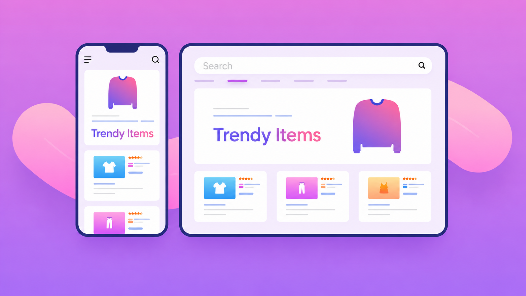
Responsive design ensures your website automatically adapts to all screen sizes including mobile, tablet, and desktop. A properly responsive website avoids layout breaking, overlapping elements, and horizontal scrolling issues. This is the foundation of a mobile-friendly experience and is also a major ranking factor for search engines.
2. Improve Page Speed
Page speed is one of the most critical factors for mobile users. If a website takes more than a few seconds to load, most visitors will leave immediately. Compress images, reduce unnecessary JavaScript, and avoid heavy plugins or animations that slow down rendering.
3. Use Readable Fonts
Mobile screens require clear and legible typography. Avoid extremely small fonts or overly decorative styles that reduce readability. Proper font size, spacing, and contrast ensure users can read content comfortably without zooming.
4. Simple Navigation
Mobile users prefer quick access to information. Keep navigation menus clean and minimal with only essential items like Home, About, Services, Blog, and Contact. A confusing navigation structure increases bounce rate and reduces engagement.
5. Mobile-Friendly Buttons
Buttons should be large enough to tap easily with fingers without accidental clicks. Proper spacing between buttons improves usability and prevents frustration during interaction.

6. Avoid Heavy Popups
Popups can be useful but too many intrusive popups create a poor mobile experience. They block content, frustrate users, and negatively impact SEO performance. Use them carefully and only when necessary.
7. Clear Content Structure
Content should be structured in a way that is easy to scan. Use headings, short paragraphs, and logical flow so users can quickly understand the information. Mobile users usually skim content, so clarity matters more than length.
8. Optimize Images
Large uncompressed images are one of the biggest reasons for slow websites. Always use optimized formats like WebP and ensure images are resized properly for mobile screens.
9. Test On Real Devices
Emulator testing is not enough. Always check your website on real smartphones with different screen sizes and browsers. This helps identify layout issues, spacing problems, and touch interaction errors.
10. Focus On User Experience
A mobile-friendly website is not just about design — it is about how smooth and intuitive the experience feels. Fast loading, easy navigation, readable content, and clear actions together create a strong user experience that converts visitors into customers.